
A shorter lead form can outperform a more detailed one, but that's not the most important finding. A 2026 benchmark reported that three-field forms converted at 25.0%, compared with 12.0% for seven-field forms, while another dataset saw conversion fall from 23.1% at three fields to 6.9% at ten or more fields. Yet a short form feeding a slow, disorganized sales process can still lose the opportunity.
The form is only the entry point. The conversion system includes qualification, routing, acknowledgment, scheduling, and follow-up. These lead generation form best practices focus on that complete system, because boutique consulting firms rarely lose clients only because a form has one field too many. They lose them because nobody responds, nobody knows who owns the lead, or the prospect has to repeat information after submitting.
Table of Contents
- The Real Job of a Lead Generation Form
- Field Count and the Minimum-Viable-Form Principle
- Copy, Layout, and the Small Decisions That Compound
- Mobile, Accessibility, and Field Patterns That Quietly Fail
- Privacy, Consent, and Trust Signals in First-Touch Forms
- Speed-to-Lead and What Happens After Submit
- A Prioritized Testing Roadmap for Consulting Forms
The Real Job of a Lead Generation Form
Most consulting firms treat the form as a conversion asset. They adjust the headline, shorten the fields, change the button color, and run another test. Those changes matter, but they come after a more important question: what is the form supposed to make possible?
A first-touch form should function as a triage and handoff mechanism. It needs to identify the person, establish enough context to judge fit, and trigger the right next action. That might mean an immediate scheduling page for a strong-fit buyer, a personal reply from a specialist, or a lower-touch resource for someone still researching.
The mistake is treating submission as the finish line. Submission is the moment when the prospect has raised a hand and expects the business to do something useful with that signal. If the information sits in an inbox, context evaporates and the buying window cools.
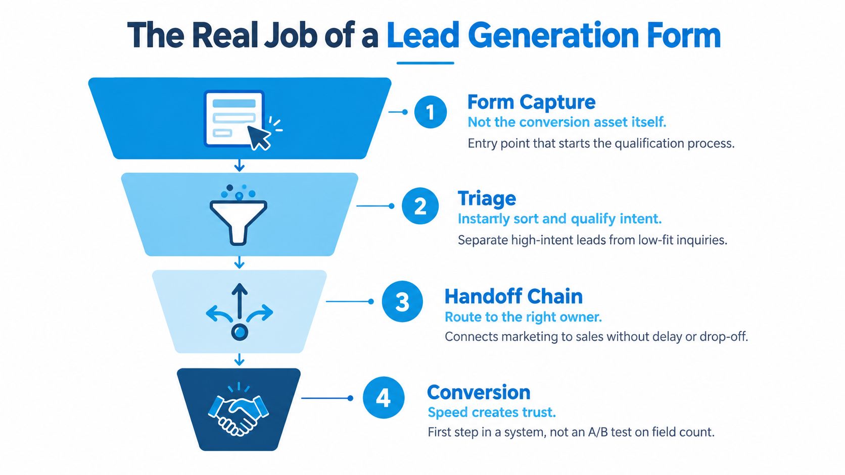
Four jobs the form must support
A useful consulting intake form enables four connected stages:
- Capture: Collect the minimum identity and contact information needed to create a usable record.
- Triage: Separate likely buyers, poor-fit inquiries, researchers, and unclear submissions.
- Handoff: Assign ownership, preserve the submitted context, and trigger the appropriate response.
- Conversion: Move the prospect toward a call, proposal, or another defined next step.
The form itself handles only the first stage directly. Its fields and answer choices should make the remaining stages easier for the people and systems responsible for them.
Advisor's rule: Don't optimize field count before you can explain exactly what happens after every meaningful answer.
A longer form can produce richer data, but it also creates more friction. A short form can increase submissions, but it creates little value if the sales team receives only a name and email with no routing logic. The right design balances capture effort against the action your team can take immediately.
For consulting firms, the strongest form is rarely the one with the most information. It's the one that gives the right owner enough context to respond intelligently, quickly, and in the language of the prospect's stated problem.
Field Count and the Minimum-Viable-Form Principle
The minimum-viable-form principle is simple: ask only for information that helps you qualify, route, or respond meaningfully at the first touch. Defer everything else to enrichment, a discovery call, or a later step.
The evidence is clear. A 2026 benchmark analysis reported conversion of 25.0% for three-field forms, compared with 23.0% for four fields, 20.0% for five, 15.0% for six, and 12.0% for seven fields, as documented in this B2B lead form benchmark analysis. A separate dataset cited by the same source found conversion declining from 23.1% at three fields to 17.0% at five, 11.4% at seven, and 6.9% at ten or more fields.
That doesn't mean every consulting form should contain three fields. It means every additional question needs a job.
What belongs on the first touch
For a high-intent consulting form, start with:
- Name: So the response feels personal and the record is identifiable.
- Work email: So the firm can respond and distinguish business inquiries from anonymous submissions.
- Company: So the team can assess basic fit and prepare for the conversation.
- One qualifying question: Ask about the primary problem, engagement timing, company size, or budget band, depending on what determines routing.
You can collect more when the answer changes what happens next. A timeline question might route an urgent transformation project to a senior advisor. A company-size question might determine whether the inquiry fits your delivery model. A problem-area question might assign the lead to the right specialist.
Phone number, detailed job title, revenue, and a long project description usually belong later, especially on a cold visit. They ask for personal or effort-intensive information before the firm has earned enough trust.
For more context on connecting lead capture with email follow-up, see this guide to generating leads for email marketing.
First-touch versus deferred fields
| Field | First-Touch Form | Defer to Follow-Up | Reason |
|---|---|---|---|
| Name | Yes | No | Needed for a human response |
| Work email | Yes | No | Primary response channel |
| Company | Usually | Sometimes | Supports basic fit and preparation |
| Primary challenge | Usually | Sometimes | Helps route the inquiry |
| Company size | Sometimes | Often | Include when it changes qualification |
| Engagement timeline | Sometimes | Often | Include when urgency affects ownership |
| Budget band | Selectively | Often | Use only when budget determines fit |
| Phone number | Usually no | Yes | Can create unnecessary privacy friction |
| Full job title | Usually no | Yes | Often inferable from a conversation or research |
| Revenue | Usually no | Yes | Add only if it changes the sales decision |
| Detailed project description | Usually no | Yes | Better gathered after initial trust is established |
The decision rule is strict: add a field only when the disqualification it enables is decisive and the answer can't reasonably be inferred from public information or a short call.
Consider two forms feeding the same sales motion. A six-field version asks for name, email, company, role, company size, and project description. A ten-field version adds phone, revenue, budget, timeline, and a second descriptive question. The longer form may look more useful in the CRM, but the additional effort can reduce submissions sharply. If the team still calls every viable lead, the extra data hasn't improved the process. It has only reduced the number of people entering it.
Copy, Layout, and the Small Decisions That Compound
Form copy should answer one question immediately: what happens after I complete this? A headline that repeats “Contact us” wastes the most visible space. Use the headline to name the outcome, such as “Discuss your revenue operations bottleneck” or “Book a working session for your next growth decision.”
The button should complete the visitor's internal sentence, “I want to…” “Book my strategy call” is specific. “Submit” is not. “Download” is actively misleading when the offer is a consultation.
Reduce recall and interpretation
Use a single-column layout as the default. It gives the eye one path through the form, works cleanly on mobile, and reduces the chance that users skip across a row. Two columns are acceptable for logically paired fields, such as first name and last name, but don't use them to compress unrelated questions.
Place labels above inputs rather than relying on placeholders. Top-aligned labels remain visible after typing, support screen-reader interpretation, and survive browser autofill more reliably. Placeholder-only labels can work when the form is extremely short and mobile space is the binding constraint, but they're a poor default for a serious B2B intake process.
Use multi-step presentation when qualification requires more than five inputs. The point isn't to disguise a long form. It's to group related questions, show progress, and avoid presenting a wall of inputs at once.
Remove the copy that creates doubt
Replace vague reassurance with concrete expectations. “We respect your privacy” doesn't tell a prospect what you'll do with the data. A clearer line explains who will respond, what the next step is, and whether marketing communication is optional.
Avoid jargon-heavy labels such as “transformation readiness” if a buyer would describe the issue as “We need a repeatable sales process.” Ask questions in the language prospects use during discovery calls. Familiar wording lowers interpretation effort and gives the sales team more useful answers.
A practical review should cover:
- Headline: States the problem or outcome, not the internal campaign name.
- Labels: Remain visible while the user types.
- Button: Names the next action and matches the offer.
- Error text: Explains how to fix the problem, rather than saying only “Invalid input.”
- Privacy line: Describes data use plainly and links to the relevant notice.
These decisions compound. A vague headline creates uncertainty, a placeholder disappears, a crowded layout increases effort, and a generic button weakens the value exchange. None needs to break a form alone. Together, they can separate a form that earns attention from one that loses qualified buyers.
Mobile, Accessibility, and Field Patterns That Quietly Fail
“Mobile-friendly” isn't a sufficient standard. Test the form under the conditions that expose failure: a narrow screen, browser autofill, keyboard navigation, zoom, screen-reader output, and a user trying to complete the form with one hand.
Start with the thumb-zone test. On screens under 480px wide, keep the primary CTA and submit action within the natural reach area without forcing the user through an unnecessary scroll. Use tap targets of at least 44 by 44 pixels, a mobile accessibility recommendation documented in this lead capture form UX guidance.
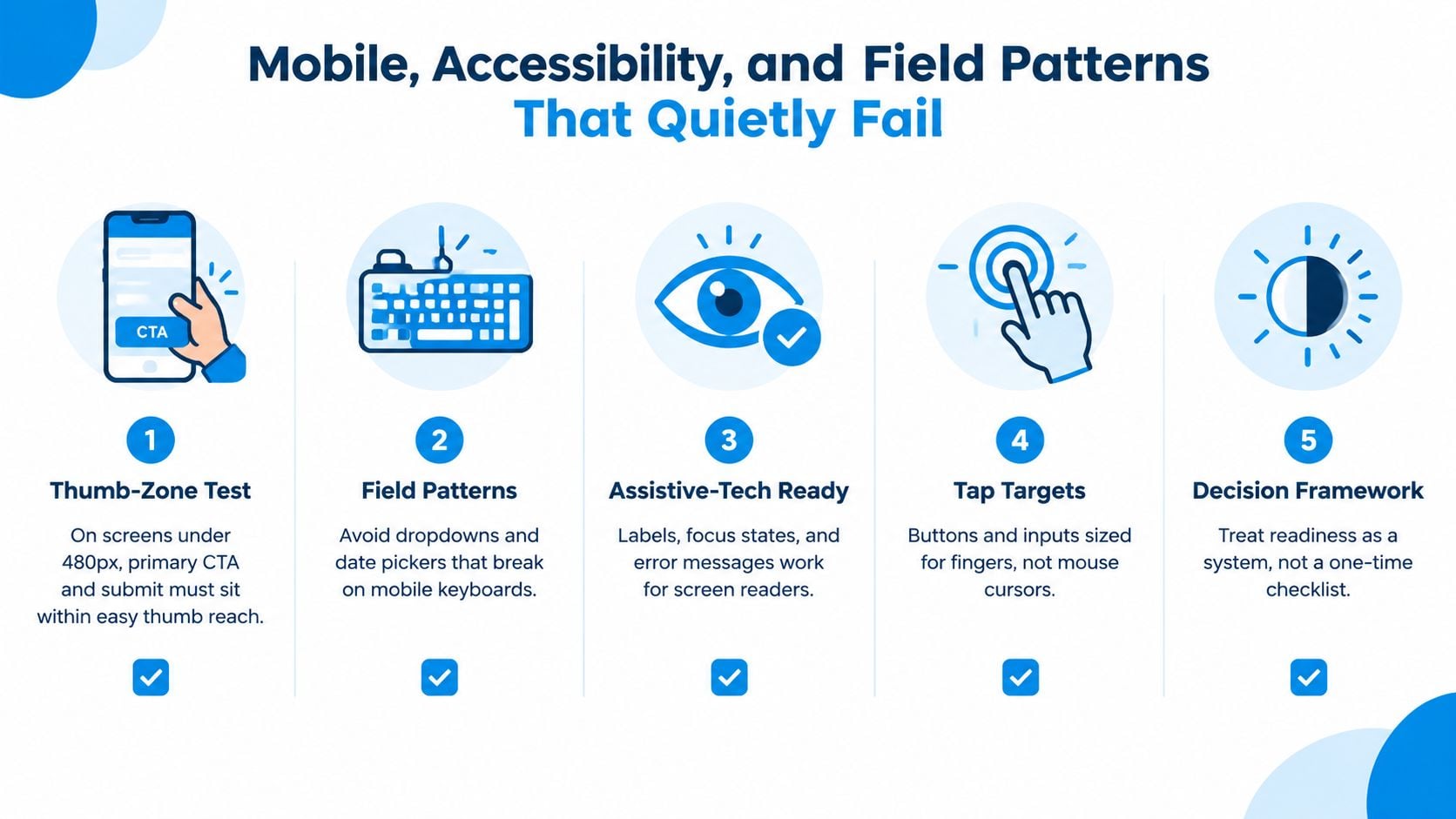
Audit the field patterns
Some controls create friction that field-count reports won't reveal:
- Company names: Use a standard text field and normalize the value in your CRM. Don't force prospects through an overbuilt lookup that fails for small firms or unfamiliar entities.
- Long dropdowns: Avoid dropdowns with more than seven options unless the choice is essential and the control remains easy to use.
- Calendar pickers: Check that scheduling controls work without hidden frames, awkward scrolling, or a desktop-only interaction model.
- Address fields: Don't expand a consulting intake form into multiple address inputs unless location is truly relevant to delivery.
- Placeholder-only labels: Keep a visible label so the field remains identifiable after typing or autofill.
For accessibility, associate each error message programmatically with its field through aria-describedby, preserve a visible focus state, and confirm the complete form works by keyboard alone. Screen-reader users should hear the label, input purpose, required status, and error guidance in a logical order.
Deviate only with evidence
A specialized field pattern can be justified when it serves a real qualification need. A budget band may be useful for routing, while a phone number may be necessary for a call-based service. The deviation should come from observed business value, not design preference.
If an exception improves qualification, prove that the value of the retained segment outweighs the users lost to the added friction.
Privacy, Consent, and Trust Signals in First-Touch Forms
Privacy language is part of the conversion experience, not legal decoration. A consulting prospect is handing over business context and personal contact information, often before knowing who will see it or what follow-up will look like.
A first-touch form should make five things clear:
- Purpose: Explain why you're collecting the information.
- Marketing consent: Keep promotional consent separate and unchecked by default where explicit opt-in is required.
- Privacy notice: Link directly to the relevant policy.
- Responsible contact: Name the data controller or responsible firm contact where applicable.
- Retention and next step: Explain what happens after submission and how long information is retained, subject to your legal obligations.
GDPR and CAN-SPAM requirements depend on the circumstances, jurisdiction, and communication type, so legal review matters. The recurring implementation failures are practical: bundling consultation consent with marketing consent, pre-ticking boxes, and hiding withdrawal instructions in dense text.
Put each element where it helps
| Element | Purpose | Placement | Common Mistake |
|---|---|---|---|
| Purpose statement | Explains the data exchange | Above the fields | Using vague language such as “process your request” |
| Marketing consent | Records permission for promotional follow-up | Separate checkbox near the CTA | Making it required for a consultation |
| Privacy notice | Gives access to data-handling details | Directly below or beside the form | Linking only from the site footer |
| Responsible contact | Identifies accountability | Near the privacy explanation | Omitting a clear point of contact |
| Retention language | Sets expectations | Short line beneath consent | Leaving the prospect to guess what happens next |
| Withdrawal instructions | Supports preference changes | In consent language and later emails | Burying the process or making it difficult to find |
Trust signals should match the buying context. A relevant SOC 2 or ISO badge can help when security is part of the engagement, but an unrelated badge adds visual noise. Named firm credentials, relevant partner experience, and a clear response-time promise near the CTA usually provide more useful reassurance for a small advisory firm.
Keep legal copy readable. Put the essential explanation close to the action, then link to the full notice. The form should feel transparent without turning the submission area into a contract wall.
Speed-to-Lead and What Happens After Submit
The submit button starts the conversion process. A cited benchmark reports an average new-lead response time of 17 hours and 49 minutes, while contacting a lead within five minutes can reduce lead loss by about 80%, according to this speed-to-lead interview and benchmark source. Treat those figures as operational guidance, not a reason to collect more fields.
For consulting firms, the useful metric is CPQL, or cost per qualified lead, rather than raw CPL. A qualified lead is one that matches the firm's fit and intent criteria and survives the routing and sales-acceptance process. Cheap submissions that never become conversations are not efficient acquisition.
Build the handoff in three moves
Instant acknowledgment confirms receipt and sets expectations. It should repeat the stated problem or requested service where possible, provide a scheduling option for appropriate leads, and explain when a human will respond.
Intelligent routing assigns the record based on the information the form can reliably capture. Useful inputs may include company size, decision role, problem area, timeline, and budget band where appropriate. Don't ask for all of these automatically. Expose only the inputs that change ownership or urgency.
Matched follow-up should address the prospect's stated issue. Someone asking about sales process design shouldn't receive a generic newsletter before anyone acknowledges the operational problem they described.
Use response targets based on intent:
- High-intent consultation forms: Aim for under five minutes.
- Mid-intent content offers: Aim for under thirty minutes.
- Newsletter and event captures: Same-business-day follow-up is usually appropriate.
These are operating recommendations, not universal laws. Your team should test them against staffing, time zones, and the actual quality of each source.
Instrument the entire path
Track each field interaction, not only completed submissions. Preserve campaign and source attribution, record routing timestamps, and connect the lead to sales acceptance and eventual opportunity status. Feed closed-won and closed-lost outcomes back into the qualification rules so the form reflects real commercial evidence.
A form that captures five answers but loses the record between systems is broken. Review what client onboarding requires after a handoff so the transition from qualified opportunity to delivery doesn't create another operational gap.
A Prioritized Testing Roadmap for Consulting Forms
Most firms test the easiest variable first, usually field count. That sequence is backward. If the offer is unclear or the form headline doesn't match the page that sent the visitor, structural testing produces noisy results.
Use a three-phase roadmap.
Phase one starts with message match
Spend two weeks testing offer clarity and message match, with one variable per form view. Compare a problem-led headline against an outcome-led headline, or test a button that says “Book my strategy call” against one that says “Request a consultation.” Keep the form structure stable so the result tells you something about the message.
The leading question is whether the visitor understands the exchange. If the page promises an advisory conversation but the form says “Get the guide,” the problem isn't field count. It's a broken expectation.
Phase two isolates form friction
Next, test field count and field type over two to three weeks. Use a single-column holdout and compare the minimum viable version against a version with one additional qualification question. Measure both completion and qualified-lead rate, not just submissions.
For each test, define success before launch:
- Qualified-lead rate: Look for a lift of 10% or more.
- Completion rate: Accept no drop greater than 5%.
- Tier-one routing latency: Keep it under five minutes.
- Test duration: Run for at least two weeks or until the agreed confidence threshold is reached.
The numerical thresholds above are operating rules for a testing program, not universal industry benchmarks. Use them consistently so the team doesn't declare victory based on a convenient short-term fluctuation.
Phase three tests the handoff
Run routing, alerts, scheduling, and follow-up cadence tests over four weeks, using CPQL as the primary read. Compare immediate calendar access with a human-assigned reply, or test whether problem-specific follow-up outperforms a generic confirmation.
Run one major change at a time and document the hypothesis, audience, dates, owner, primary metric, and decision in a shared log. If traffic is below 200 submissions per variant per month, rewrite the copy before testing structure. Small samples can hide real winners, so prioritize clear messaging and operational reliability first.
Use the same discipline for referral-source experiments. A form variant may attract more inquiries while producing weaker relationships, so connect the result to downstream outcomes and review how to track referrals.
The practical priority is clear: fix message match, reduce unnecessary friction, then improve routing and follow-up. A prettier form won't rescue a handoff that no one owns.
Starward Navigators provides client acquisition infrastructure for small consulting and advisory firms, including connected forms, lead routing, automated follow-up, appointment reminders, proposal tracking, and client handoffs. If your form submissions disappear into inboxes or stall before a real conversation, visit Starward Navigators to see how the operating system connects intake to the next action.